Creative Strategy | Presentation Design | Colour & Gradient Design | AI-Enhanced Imagery | Art Direction | End-to-End Production
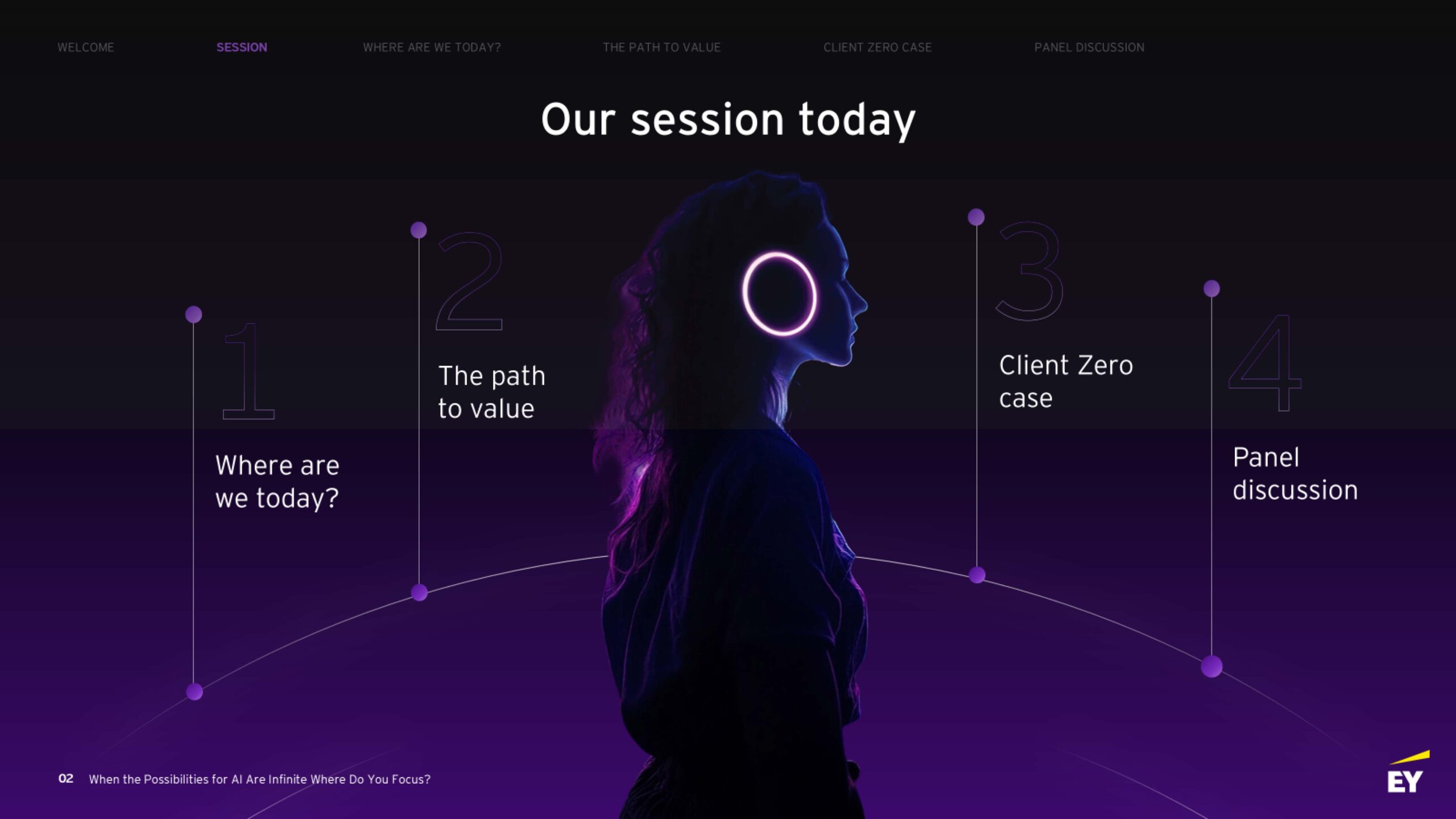
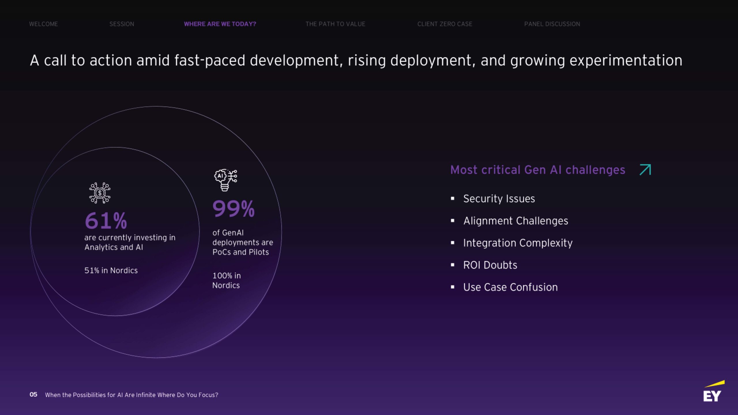
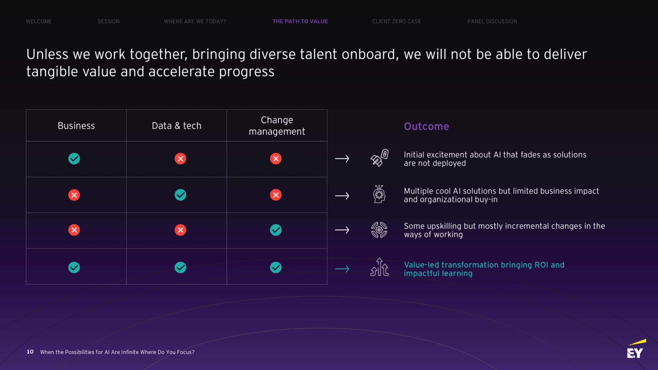
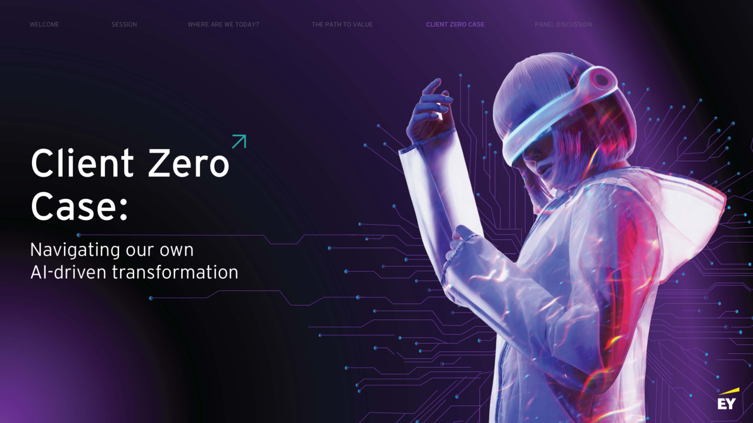
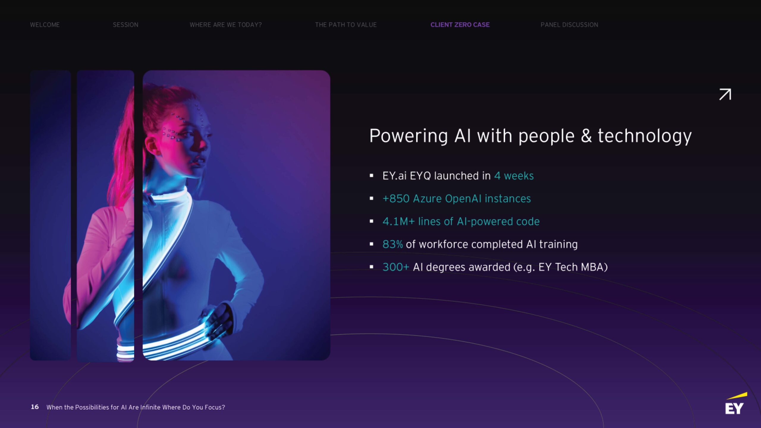
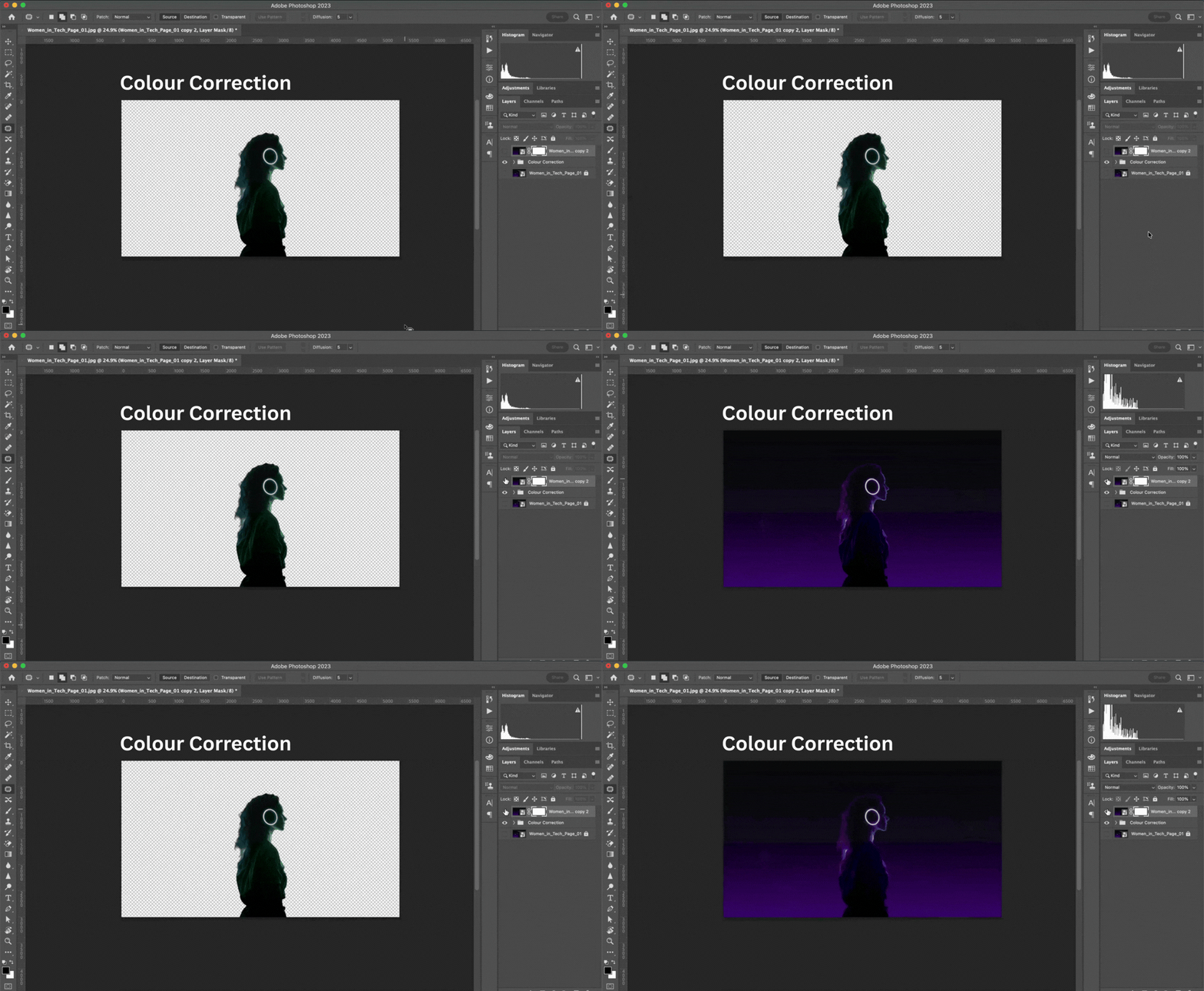
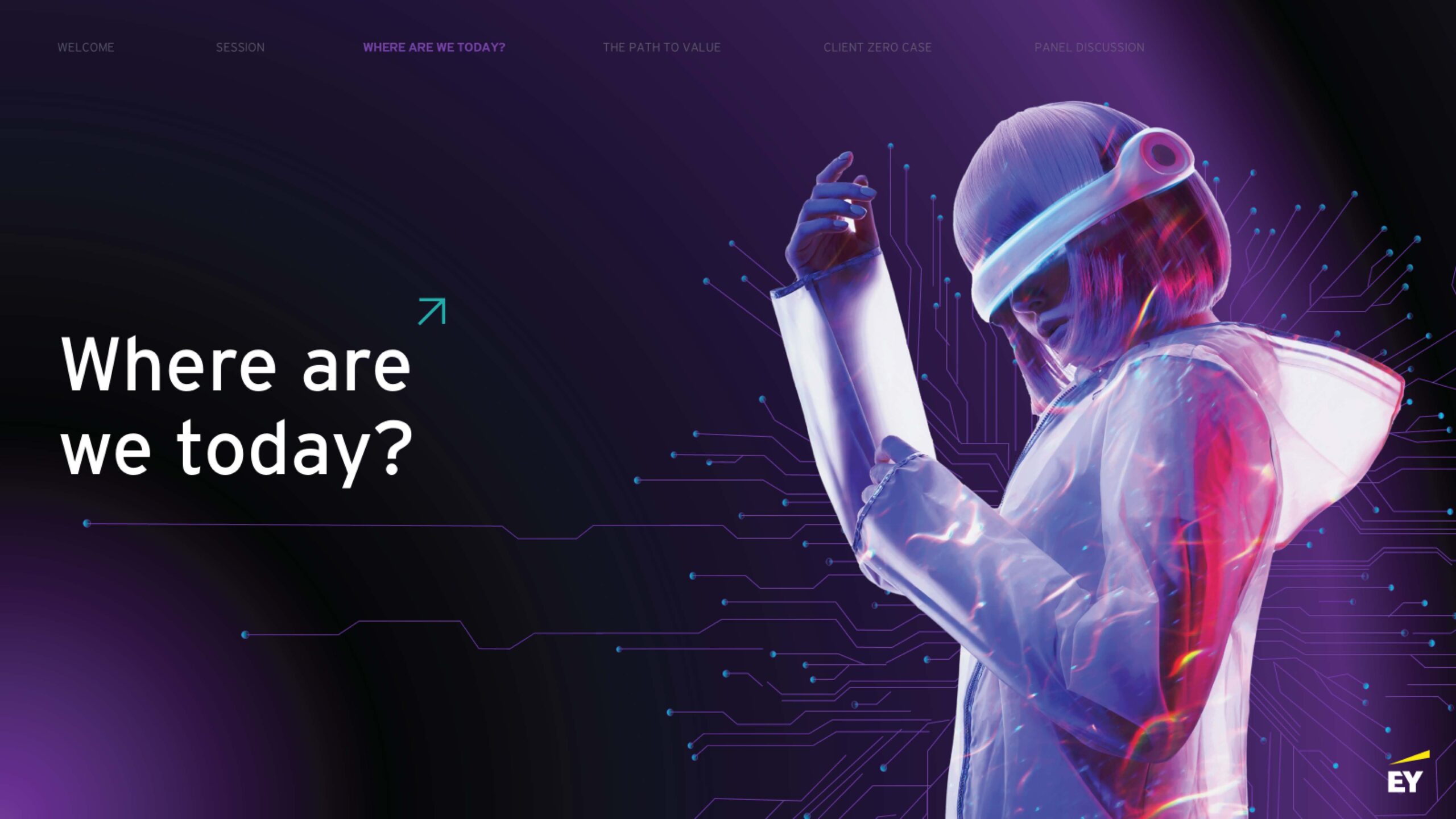
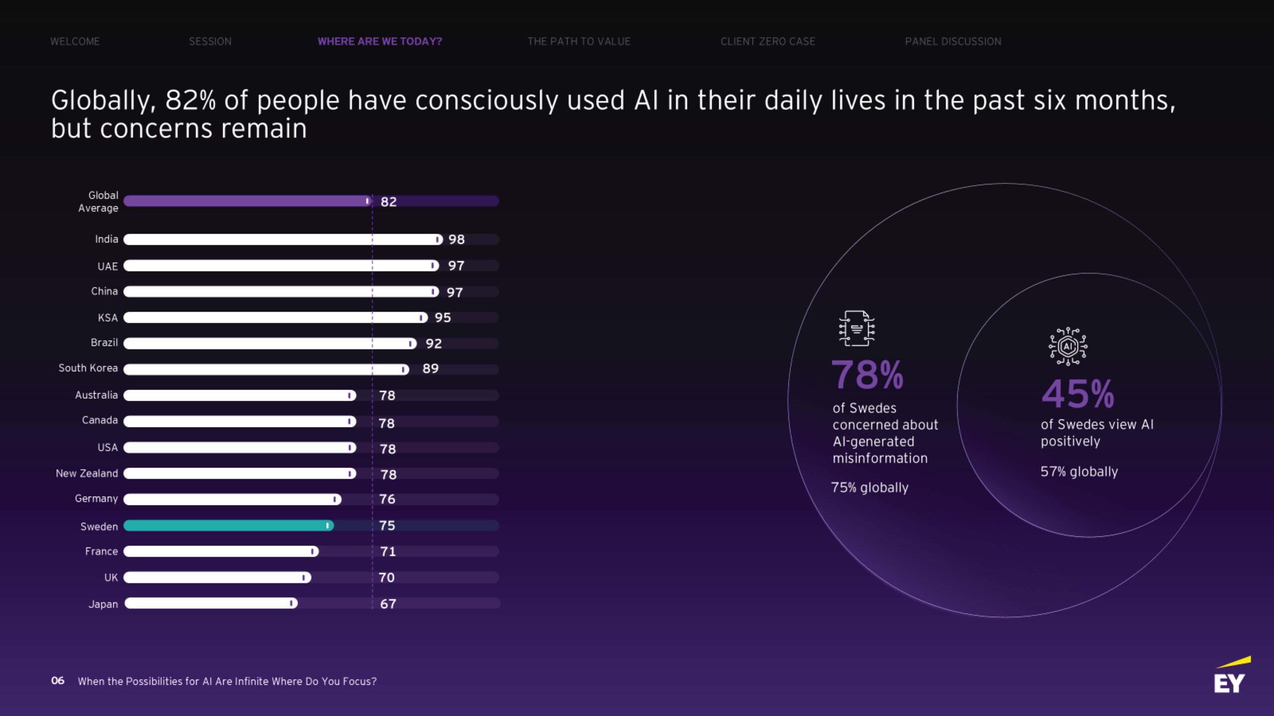
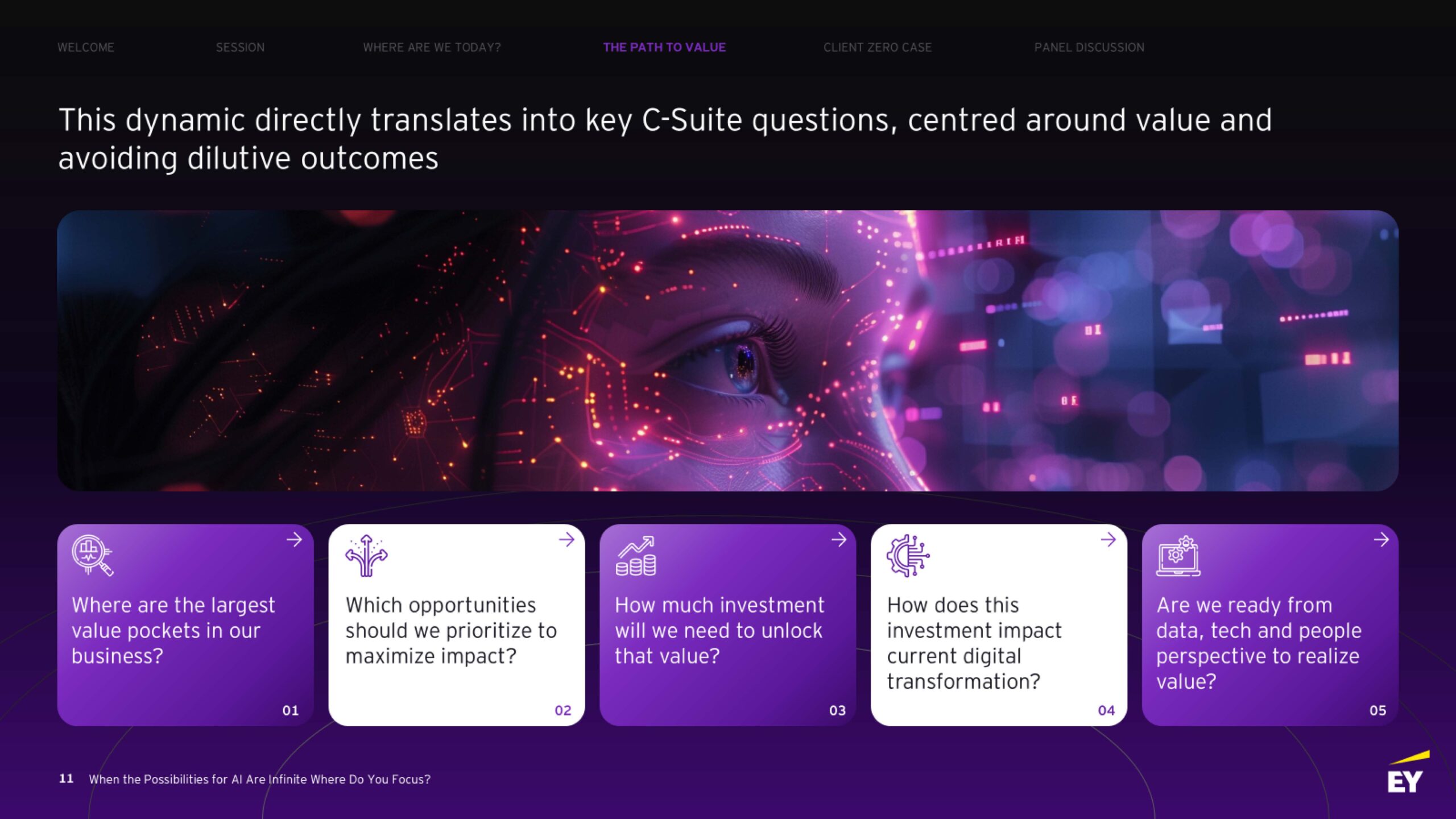
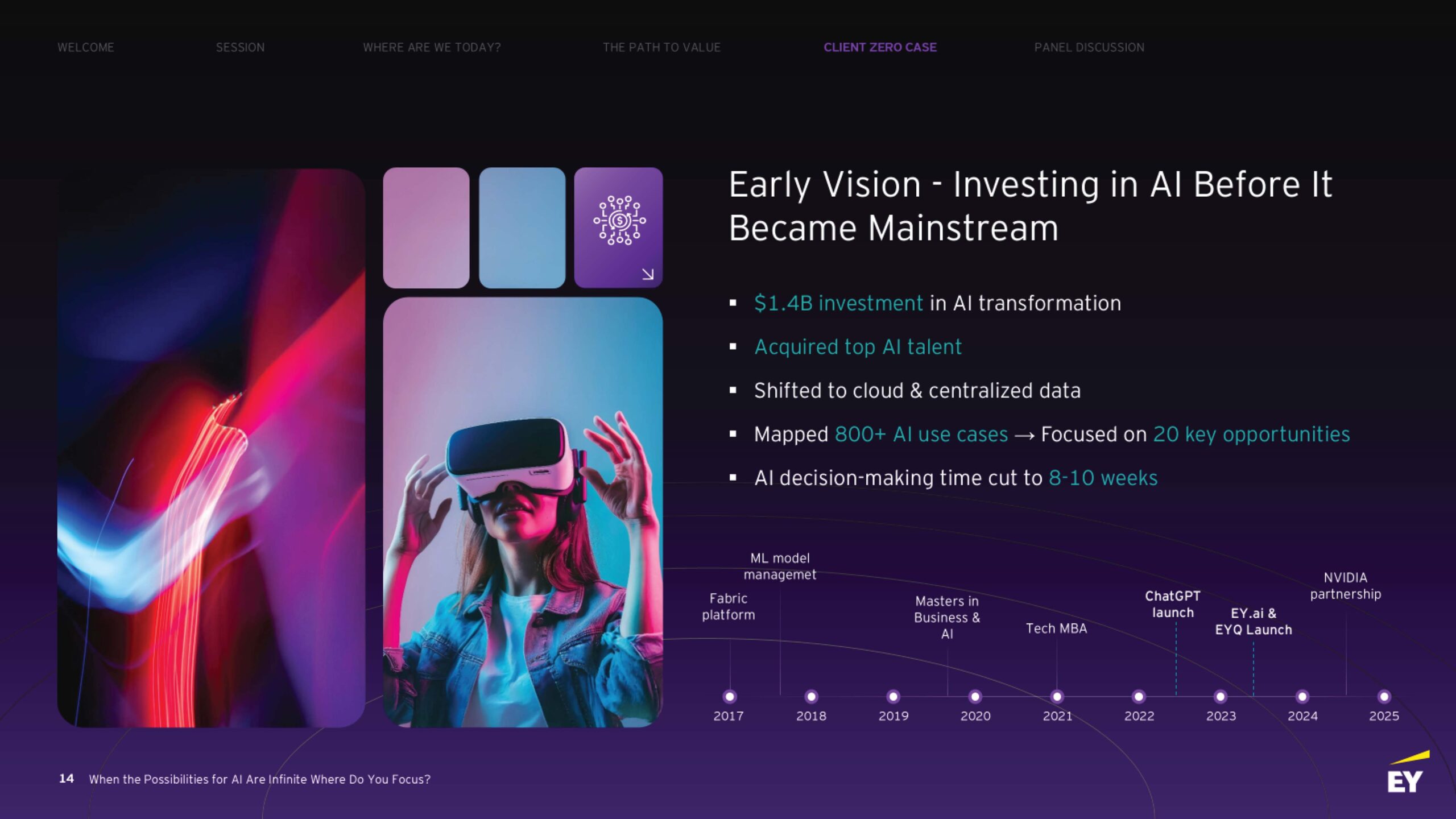
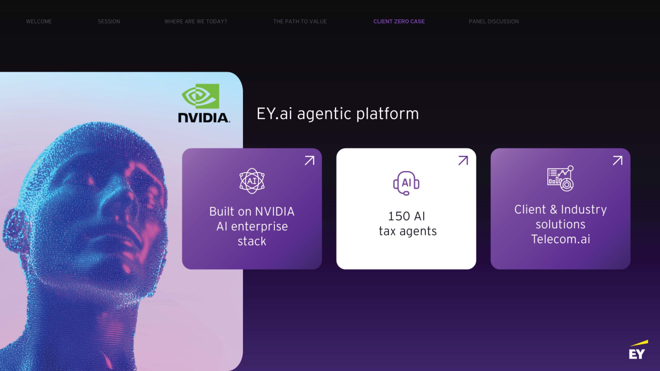
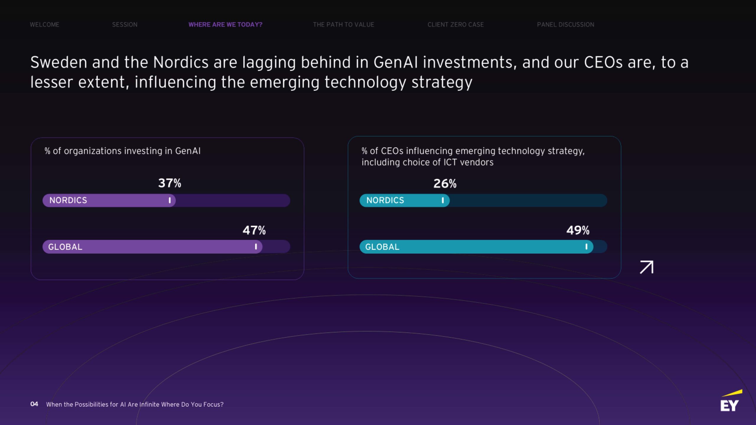
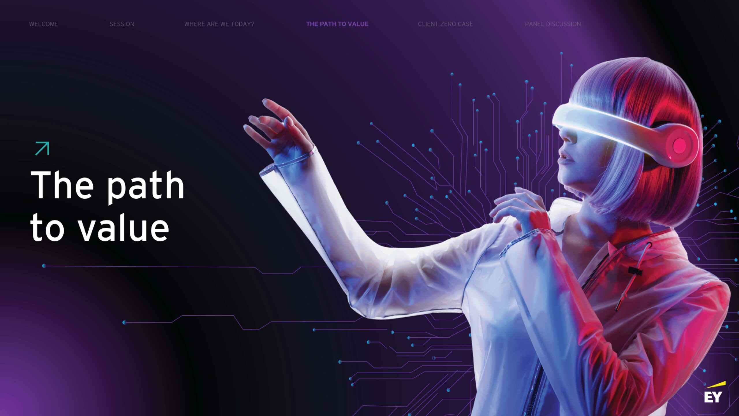
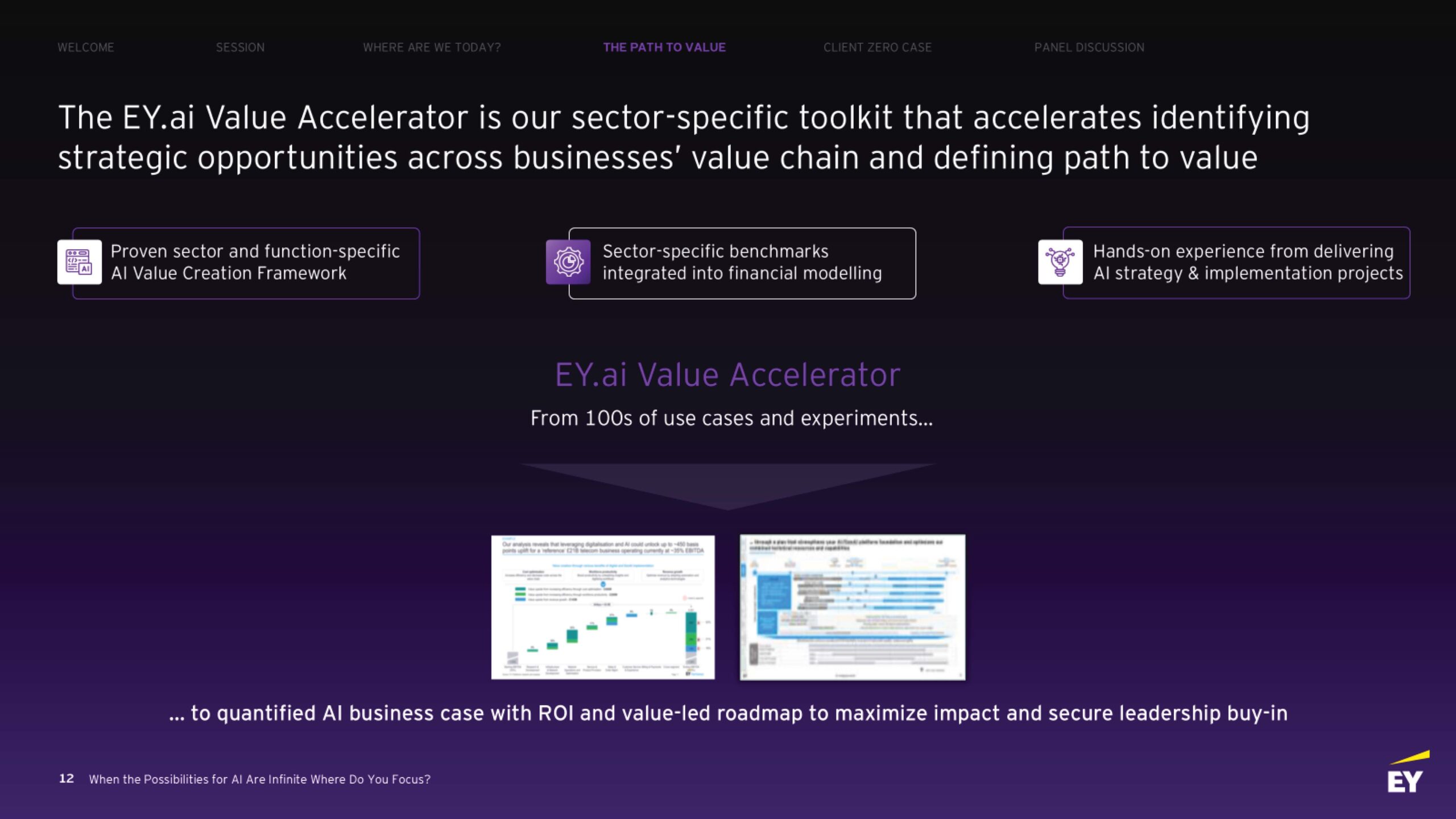
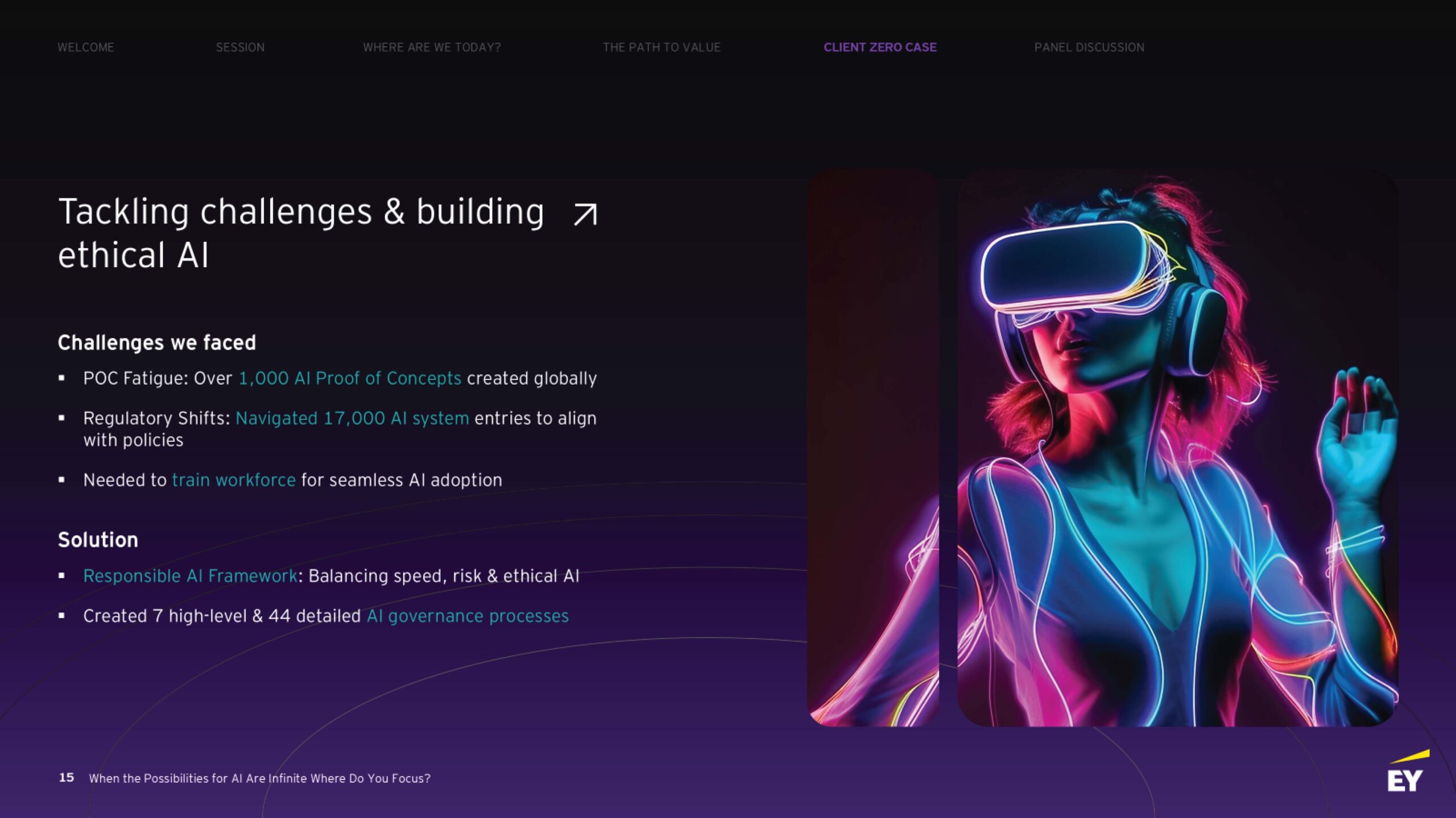
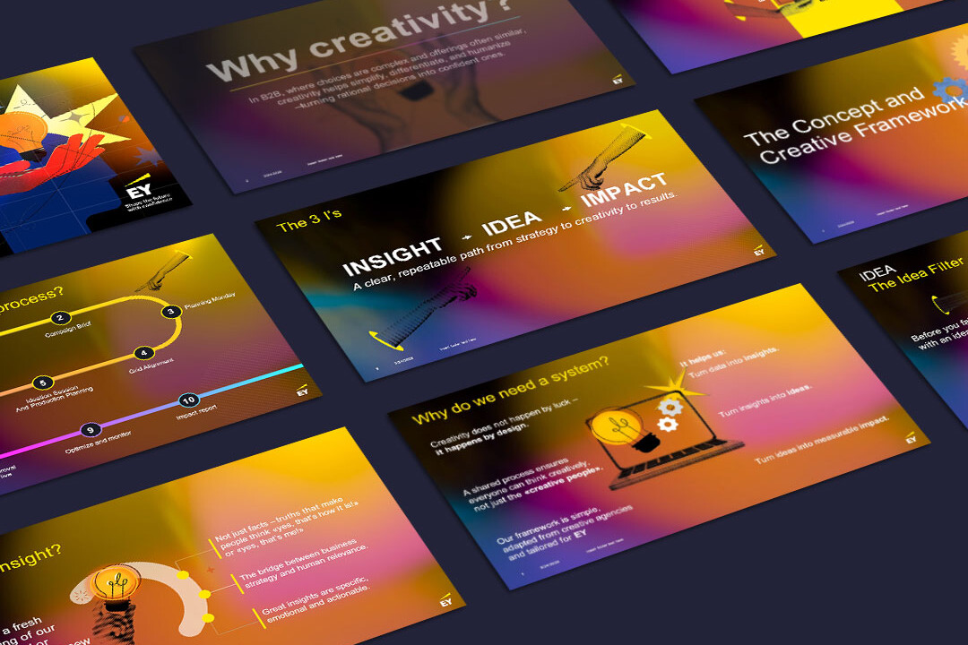
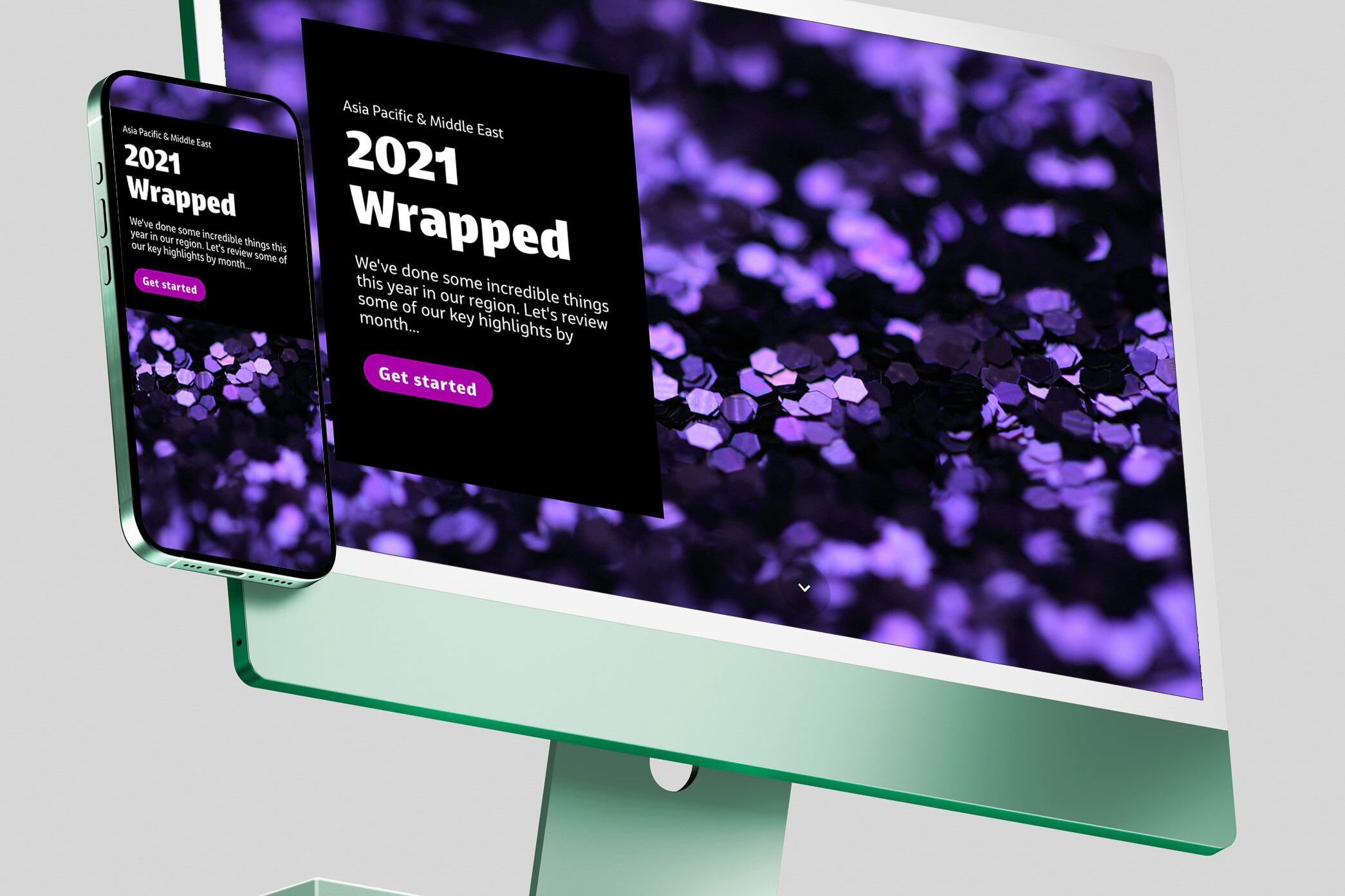
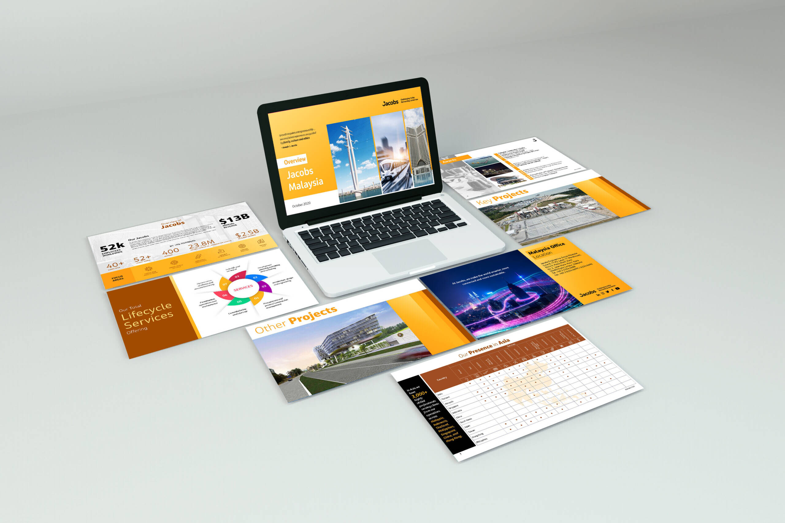
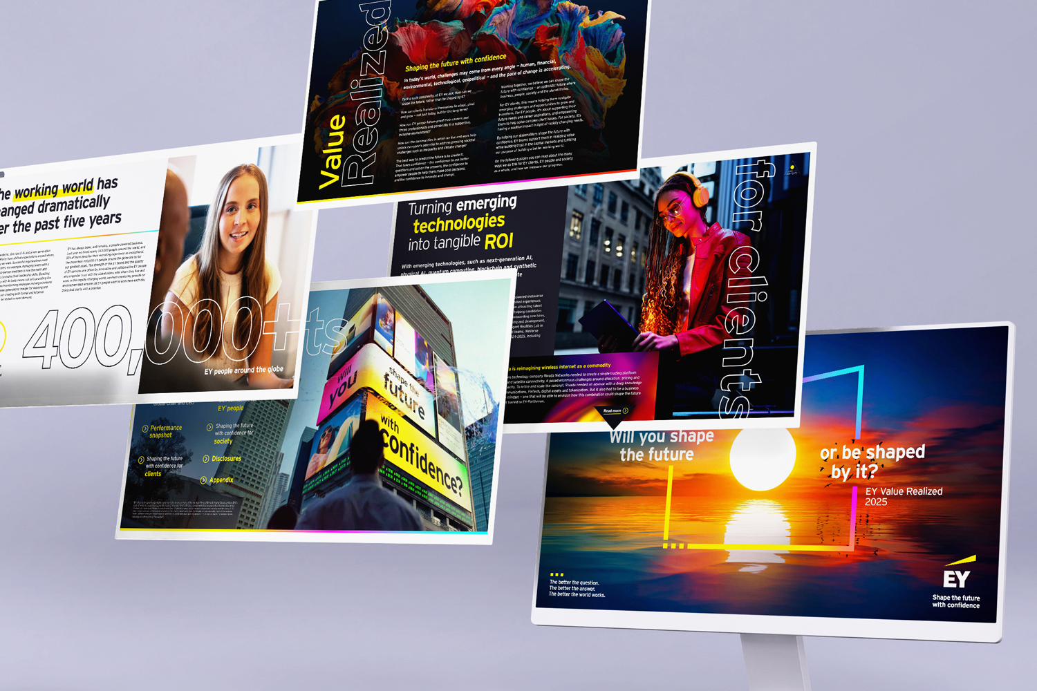
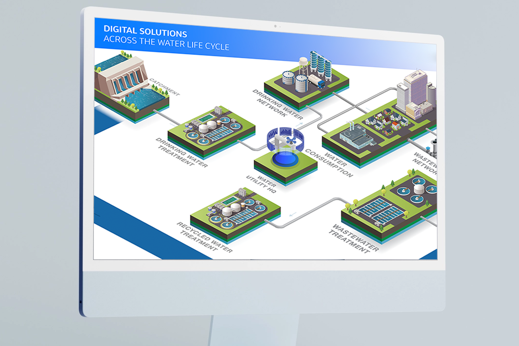
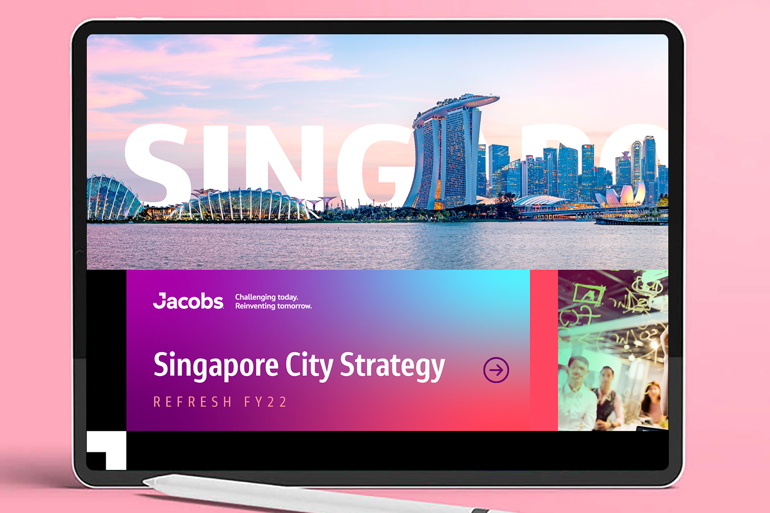
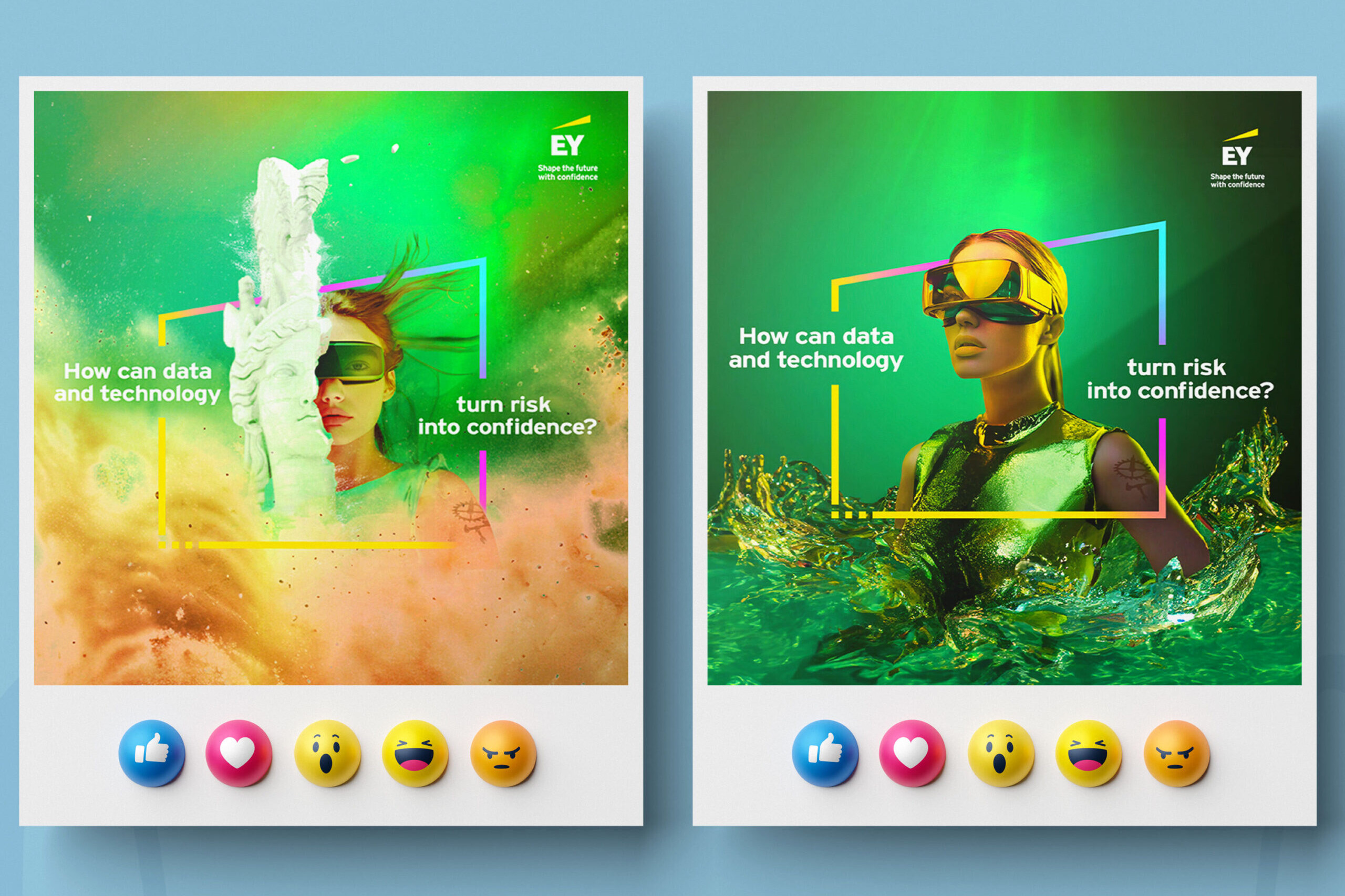
This project was a welcome creative opportunity, with the client opening the door to explore a design direction beyond the usual brand guidelines. Leaning into the company’s secondary colour palette as the foundation, the design was taken in a fresh and distinctive direction by experimenting with gradients to add depth, dimension, and a modern visual quality throughout the presentation. One of the more considered aspects of the process was the treatment of imagery, all visuals were sourced from stock but underwent careful colour correction to ensure they felt cohesive and purposeful rather than generic. Adobe Firefly was also brought into the process to further enhance and refine select images, leveraging AI to extend backgrounds, adjust compositions, and elevate the overall quality of the visuals in a way that felt seamless and intentional. This extra layer of post-processing unified the look and feel across every slide, making the imagery feel bespoke and considered. The result was a presentation that felt elevated and creatively bold while still maintaining a subtle thread back to the brand’s identity.